11.03.2009

turkey time

IMG_8440

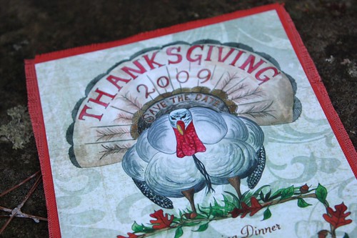
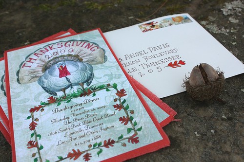
Every holiday deserves a little recognition. Thanksgiving isn't one of the holidays you typically receive an actual invitation for, but I for one prefer this over a phone call! It's a special day of family and food to give thanks for. So when we were asked to come up with a really fun invite, Currier whipped up a gorgeous watercolor turkey. Then we adhered the card to some linen fabric and frayed the ends - very festive and Fall. Plus the Macy's Day stamps they have at the post office are simply divine.
IMG_8430

a clear vision

IMG_8089

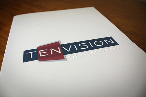
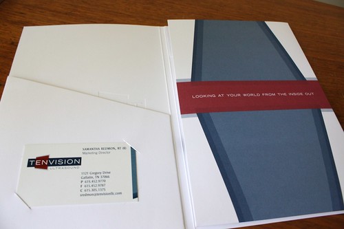
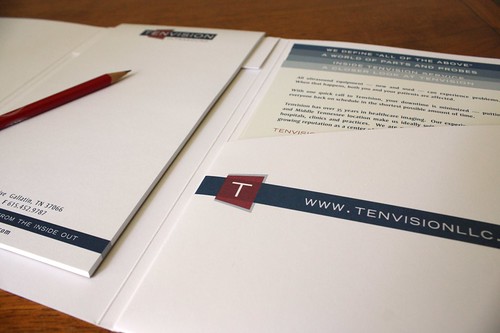
I believe we've posted about this project before, but now it's even better than the first go round. Our client, Tenvision, needed to order more tri folds we'd designed for them. This time though, they really wanted to improve the durability of the folded sections and change paper stocks. So, we tinkered around with a couple of ideas and between us and our fabulous printer's suggestions… a new and improved folder was born. It's sturdier to hold the notepad & the un-coated, thick paper we choose showcases the embossed (raised) cover beautifully. The logo was embossed and the word "ultrasound" was blind embossed, creating a beautiful silhouette. We're always open to improvement and in this case, revisiting an existing idea in a new way, produced an even better result.

IMG_8096

IMG_8101

11.02.2009

off and running

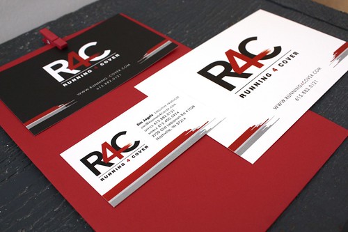
We met Jim back when we had just opened Tenn Hens doors in 2005. We were designing a project for CMT, where he was working, and he sought us out recently as he started this new business venture. Running 4 Cover is a Nashville based production company. They represent a group of video directors and also offer an in-house studio. We were thrilled to hear from him and find out he'd gone out on his own. I guess you could say we root for the upstart. After all, it's what we did!

Some clients come to us looking for a little polishing up of their existing brand. In this case, he already had a logo and great looking website. What he needed was to pull together their marketing and create a really cohesive look. Tenn Hens designed business cards, labels and note cards based on his existing look. We wish him much success.

IMG_8506