2.28.2010

fashion forward

This project is still in the works, but we couldn't wait to share it. Tenn Hens is designing a website for Hemline of Nashville. It's a women's boutique offering all the most fashionable brands. We also did a photoshoot to capture some of their eclectic style. The store is full, rack after rack, of pretty little numbers. You may just have to make a trip to see for yourself!

HemlineComp1

IMG_9269_a

2.26.2010

little book of land

Land Trust cover

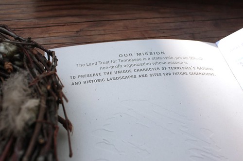
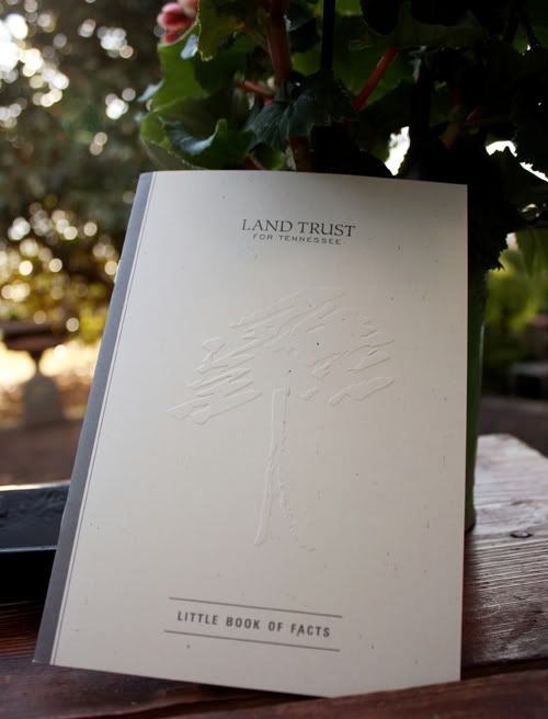
"TENNESSEE HAS MORE TREE SPECIES THAN ALL OF EUROPE COMBINED."
This statement reflects one of the powerful tidbits compiled for the Land Trust for Tennesse's "little book of facts." Tenn Hens has worked with the Land Trust in the past and feels a deep connection to their mission of preserving the unique landscape of our state. Tennessee is incredibly lucky to have such a passionate and active organization.

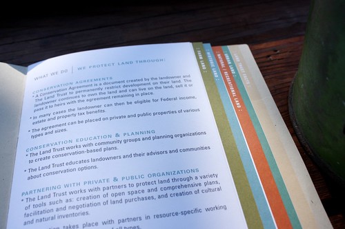
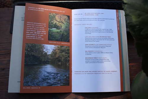
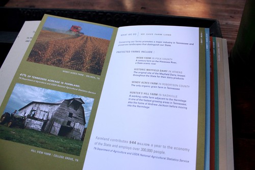
The vision was to create an informative booklet that clearly expresses the message of the Land Trust. We designed the brochure by highlighting sections of each service area: Farm Land - Historic Land - Natural/Recreational Land - Urban Land. This creates an informative and concise booklet of facts for the Land Trust to use out in the community as they continue to spread their message.

IMG_9436

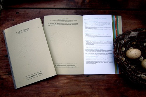
Oh and check out the embossed tree on the cover. It's a very textural and subtle effect on the recycled paper. So lovely!

IMG_9367

IMG_9366

IMG_9369

IMG_9389

2.11.2010

sneak peak

We have a some new projects cooking in the Tenn Hens studio for 2010. It's too early to share all the details, but here's a sneak peak of what's to come...

HensCarton

2.02.2010

hottest ticket in town

Our assignment was to design an invitation that you'd receive from the most exclusive new club in town. It was for a sweet 16 party and needed to be incredibly cool to grab all the teenagers attention. After all… they've seen everything. Our concept started with a masculine color palette and two beautiful paper stocks in silver and deep blue. The paper did all the work. In fact, we never even used any ink. The front had the type raised with no color on top, the back was a silver foil pattern, and the numbers were die cut to reveal the blue. The best part, in our mind anyway, was the ticket at the bottom. It was something every guest was "required" to bring for admission into the party. Hopefully all the kids felt very special receiving this in the mail!

IMG_9407

close-up

IMG_9423

Photobucket

IMG_9430